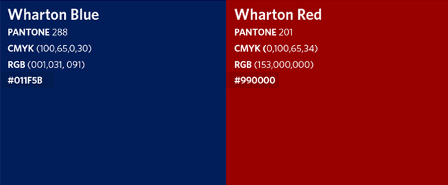
Primary Colors
The Primary Color Palette will be present on all communications. Its primary uses are large color fields, overlays, and important callout messages.

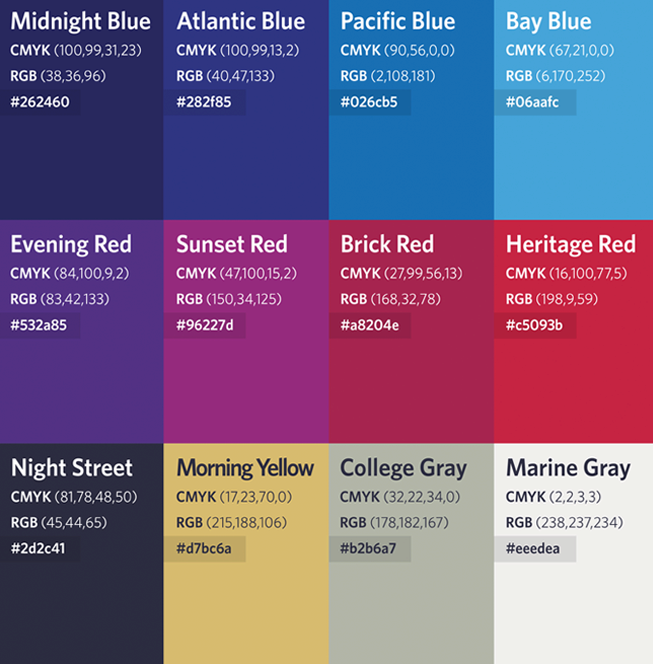
Secondary Colors
The Secondary Color Palette provides additional colors to be used on design elements. Consistent use of the secondary palette will make them recognizably Wharton.

Using Colors
Wharton is identified by Blue and Red. These should be the dominant colors before all others. The ratio of colors used and the mixing of these colors will result in different tones that create desirable depth to the color palette. Neutral grays (College Gray and Marine Gray) and white backgrounds set the context for these colors.

Primary Ratio
Blue should always be the dominant color when using the primary color palette. Red should appear as a supporting color to accent content, in calls-to-action, and in design elements to help convey the brand presence.

Full Spectrum Ratio
When using the full primary and secondary color palette, the primary colors should still dominate the presentation. Bay Blue is often used in overlays and to accent pieces of content that should stand out from the rest of the presentation.


