
WHARTON LOGO
SYSTEM UPDATE
CASE STUDY
The core brand guidelines for the University of Pennsylvania are designed to serve the entire institution — twelve schools and centers united under one identity.
With 400+ logos spanning the entire ecosystem (150+ core Wharton logos, 130+ Wharton grad clubs, 75+ undergrad clubs, and 70 alumni clubs) the evolution of our logo system needed to build on Penn’s strong foundation and stature, ensuring it continues to scale with precision and purpose.
Wharton’s expanded requirements called for an adaptable logo system capable of bringing every identity together. As a major global brand, this new system needed to be consistent, scalable, and unmistakably Wharton. Building on Penn’s foundation, we created a custom logo architecture that strengthens clarity, enforces governance, and drives growth.
Wharton’s Impact
150+
130+
70
5,000
200K+
108K+
The Problem
Wharton recognized the need for a new logo system that combined greater flexibility with well-defined, unified standards. The previous approach allowed departments to develop independent marks, which resulted in inconsistent spacing, sizing, and overall brand presentation.
This decentralized process led to a wide range of fonts, shield variations, and different shades of blue and red. The result was a fragmented visual identity that weakened the unified image Wharton aims to present alongside Penn.
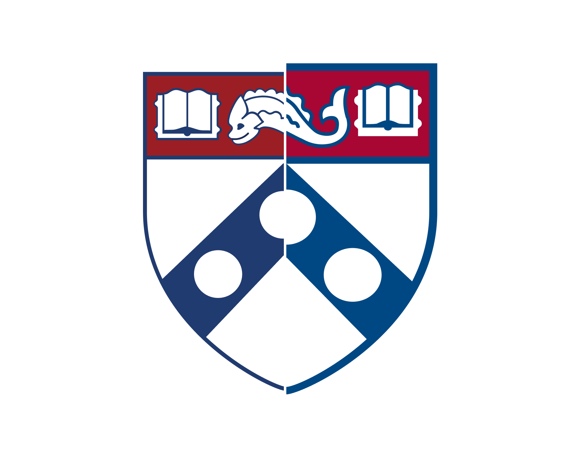
Different Shield Designs
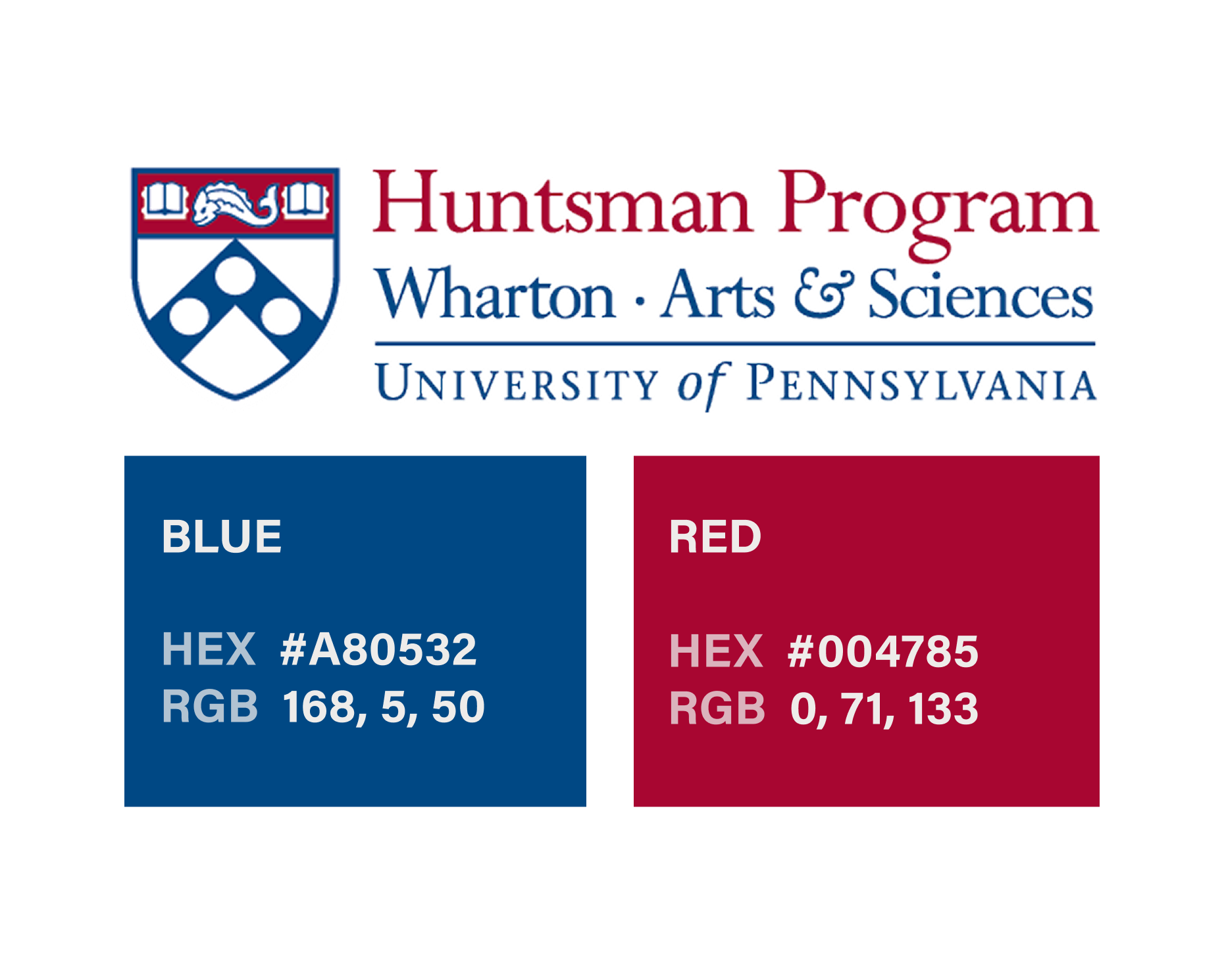
Inconsistent Colors
Irregular Font Usage and Styles
Quotes from Confused Users
“I never know which logo to use. There are so many versions floating around, and I’m afraid of using the wrong one.”
—Marketing Coordinator, Executive Education
“Every time we create materials, we spend hours searching for the ‘correct’ logo. It slows down our entire workflow.”
—Communications Manager, Undergraduate Program
“We’ve had to redesign materials multiple times because stakeholders noticed logo inconsistencies.”
—Content Producer, External Affairs
“I’m looking at the new logo design, and I’m completely puzzled. There’s no detail about the horizontal rule’s specifications – no width, no relationship to the other logo elements, nothing. I need to order embroidered shirts and create signage for our new office.”
—Content Producer, Admissions Office
The Research
To create a unified logo system for Wharton, we began by defining a clear visual hierarchy that could accommodate the diverse needs of our departments, programs, and initiatives. Central to this approach was a comprehensive description of the anatomy of the typographical structure and its elements, ensuring each component had a dedicated role within the system. We then established detailed standards for spacing, alignment, and typography. The result is a cohesive visual identity that reinforces the strength and unity of the Wharton brand.

Improvement Process
1. Audit (Understand) → We audited 400+ existing logos in the Wharton ecosystem and identified inconsistencies.
2. Benchmark (Observe) → We studied peer schools, Penn brand, and industry standards.
3. Define Framework (Define Point of View) → We established criteria: hierarchy, governance, flexibility, consistency.
4. Concept Development (Ideate) → Created multiple brand architecture and logo system concepts.
5. Visual System Design (Prototype) → Built the parent logo, sub-brand structures, and co-branding rules.
6. Review (Test) → Shared drafts with leadership, centers, and departments for feedback.
7. Refine & Document (Reflect) → Iterated based on input and codified the final system into the new Brand Guidelines.
Discovery
As an initial step, we launched a testing phase to evaluate how effectively the new logo system could reinterpret existing Wharton logos. Our goal was to ensure that logos designed under the revised system would faithfully retain and strengthen Wharton’s brand identity. Through this testing process, we compared legacy and updated marks in a variety of real-world applications, allowing us to identify which design elements best preserved the sense of connection to Wharton’s heritage while achieving greater consistency and clarity.

Logo System Construction
AI & Analytics at Wharton Initial Tests

After confirming the success of the initial tests, we launched a larger-scale evaluation to see how the new logo system performed across the full spectrum of Wharton’s brand architecture. This broader testing allowed us to assess not only each logo on its own, but also how groups, or “families,” of logos appeared together. By reviewing these families side-by-side, we could ensure that the system delivered visual cohesion at every level and scale, reinforcing consistency throughout the entire Wharton identity.

The Solution
Following our comprehensive research, we developed a robust logo system designed to serve Wharton’s extensive scale and uphold its reputation for excellence. This new framework unifies the Wharton logos across departments, programs, and initiatives, ensuring each one reflects Wharton’s prestige and aligns with Penn’s identity standards.
The following images detail the core features and structure of the updated Wharton logo system, showcasing how it delivers consistency, adaptability, and a strong brand presence across the entire School.
The Wharton Logo
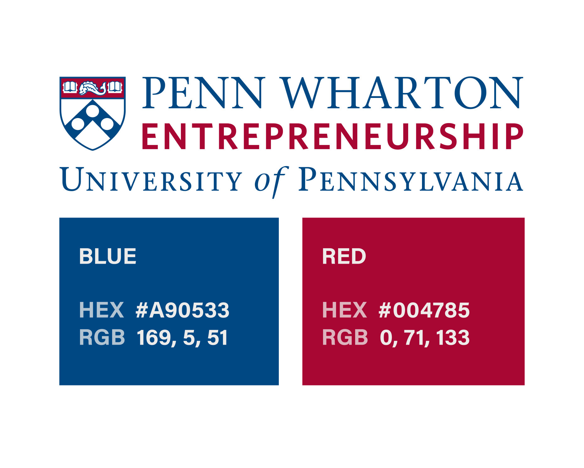
A comprehensive image detailing the specific colors and fonts used to construct the current Wharton logo.

Final Logo System Structures

Comparing Old and New
With the final system in place, we conducted a comprehensive comparison between the original and newly designed logos. The updated logos demonstrate a higher degree of visual consistency, alignment, and cohesion across departments and programs.
This new approach standardizes colors, typefaces, and layout, and also creates a sense of connection among all Wharton entities. The result is a unified and instantly recognizable brand identity that strengthens Wharton’s presence within the University and the broader community.

Implementation
The Brand Guideline Sheet
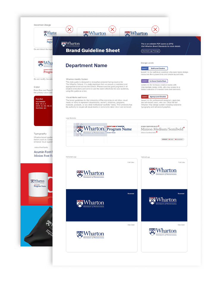
To effectively introduce the new logo system, we created a two-page printable Brand Guideline Sheet. This resource provides a visual and descriptive overview of each logo, outlining its construction, approved color variations, and detailed rules for both form and color usage. The guideline sheet is designed to be accessible, ensuring that anyone—including those without a design background—can easily understand the reasoning behind the logo design and apply it correctly in their work. This approach helps maintain consistency and clarity in all applications of the Wharton visual identity.
All official logos are now developed and designed by Wharton’s central MarComm team, guaranteeing consistency across every department and initiative, and reinforcing a cohesive visual identity for the School.
Conclusion
Wharton’s new logo system marks a significant advancement in showcasing the School’s legacy and prestige. Through careful research and thoughtful design, we created a unified framework that brings clarity, consistency, and distinction to every Wharton logo. This revitalized system empowers the School to communicate its identity with renewed strength and pride, ensuring that every touchpoint reflects Wharton’s renowned excellence and global impact.

Wharton Logo Library
Access approved Wharton logos and lockups for your department and program. Review the usage guidelines before downloading to ensure consistent and accurate representation of the Wharton brand.