
The
WHARTON
LOGO
The official Wharton logo is a unified mark that brings together the School’s name, the historic Penn shield, and the University of Pennsylvania parent into a single, carefully balanced identity asset. Centered on the iconic shield (a.k.a. coat of arms with open books, a stylized dolphin, and three white disks on a blue ribbon), the logo signals Wharton’s deep roots in Penn’s heritage while conveying a modern standard of academic excellence and global leadership. As the cornerstone of Wharton’s visual system, the logo must always appear intact, with the shield, wordmark, divider line, and University of Pennsylvania designation working together to reinforce a consistent, prestigious brand presence across all schools, departments, centers, and initiatives.


The Wharton name and logo are two of the School’s most important and visible brand assets. Please use them with care.
Important Note:
- There is only one official Wharton logo.
- There is not a separate small logo version.
- University of Pennsylvania never goes under the shield.
① UPenn Shield
The shield appears on every Wharton logo. It should not be separated from the Wharton wordmark, horizontal rule, or parent entity.
② Wharton Wordmark
The Wharton wordmark should not be recreated with type or separated from the other elements (shield, horizontal rule, or parent entity).
③ UPenn Parent Entity
The official logo is recognizable by the “University of Pennsylvania,” which is the parent brand.
④ Horizontal Rule
Dividing line between Wharton wordmark and University of Pennsylvania sub-branding.
PENN SHIELD

The iconic Penn Shield (also known as the “coat of arms”) has rich symbolism and distinctive characteristics. As a powerful and time-honored symbol, the Penn Shield is a visual cornerstone of our institutional identity, representing the esteemed heritage and unwavering commitment to excellence that define the University of Pennsylvania.


This shield was designed to appear on light and dark backgrounds with an ever-present white outline. This allows the shield to be used without being altered.

This diagram illustrates the precise grid system governing the official Wharton logo. Rather than aligning to the outer edge of the Penn Shield, all typographic elements are locked to a strict vertical axis anchored to the left stem of the letter “W”. This alignment ensures clean visual hierarchy, keeping the shield as a distinct graphic anchor to the left.
Additionally, to maintain consistent breathing room, any element must be spaced one-half shield’s width around the entire logo. See the image above for an illustration of the spacing.
Sub-Brand Types
Sub-Brand Types define the primary ways Wharton’s visual identity extends to departments, centers, programs, initiatives, and co-branded entities while remaining firmly anchored to the official Wharton logo. Each type outlines a specific naming and hierarchy convention, ensuring that every unit can communicate its distinct purpose without diluting the strength, clarity, or recognition of the Wharton brand.
While the identity system can be adapted to support these sub-brands, it is essential to safeguard the integrity of the Wharton name and accompanying elements. Any modifications to logo treatments must align with Wharton’s overarching brand standards and receive approval from Wharton Marketing and Communications (MarComm).

Department

Center

Co-Branding

Program

Initiative
Special Logos
The Wharton School maintains several special sub-brands, approved only at the University level, that serve distinct markets and audiences. These entities benefit from Wharton’s brand equity while leveraging their own unique positioning, name recognition, and market presence.
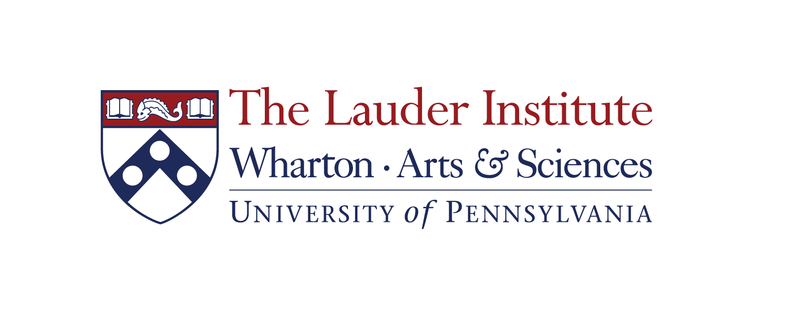
Institute name first, co-brand with Arts & Sciences

Donor’s name in the official Wharton logo

Penn red used for donor name

All caps and translation characters, co-brand with Penn
All caps and spacing

All caps embedded in the official Wharton logo
Incorrect Usage

Do not distort the image in any way.

Do not modify the colors of the logo.

Do not alter the alignment of the logo.

Do not align the business unit with the shield.

Do not add effects to the logo.

Ensure sufficient contrast; on dark backgrounds, use the approved all-white logo version.
Special Groups
Learn about the brand guidelines for your specific group.
The Brand Guideline Sheet is included with each logo system. This essential resource offers a clear visual and technical breakdown of the logo architecture, including the approved color palette and specific usage requirements. Created with accessibility in mind, these guidelines empower all team members — regardless of design expertise — to apply the Wharton visual identity with precision, ensuring brand consistency across every platform. The PDF is editable (similar to an EPS file); just ask your vendor to open the file in their vector software (e.g., Adobe Illustrator or Figma).
PennKey login is required.